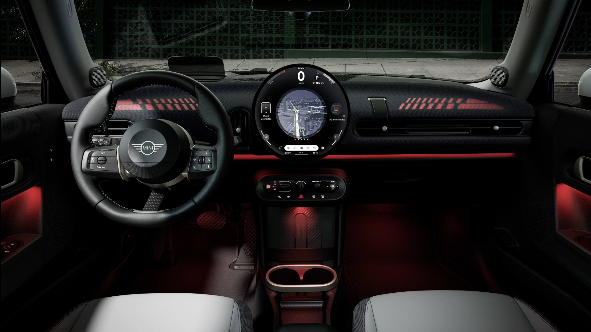
Mini has spent the better part of a decade insisting that the circular central display is untouchable — a sacred cow of the brand’s design language, as fixed in the firmament as the go-kart handling and the Union Jack taillights. And to be fair, there is genuine charm in it. The round OLED that debuted in the new Cooper family is a beautifully rendered object, a crisp, high-contrast bullseye at the centre of a cabin that otherwise leans hard into minimalism. It photographs superbly. It gives the interior an identity in a market where most dashboards have collapsed into a single anonymous slab.
But Motor1’s recent reporting that Mini won’t abandon the round screen — even while conceding it is hard to use — deserves more scrutiny than the usual heritage-defence reflex allows. The round screen isn’t a gimmick. It’s worse than that: it’s a packaging constraint that Mini has chosen to market as a virtue, and the cost is paid by anyone who actually tries to operate the car at speed.
The Geometry Problem
Here is the fundamental problem. A circle is the least efficient shape for presenting rectangular information, and a car’s interface is almost entirely rectangular information. Lists, maps, menus, album grids, radio presets, climate scales — all of it is built on a grid. Force that grid into a disc and you either letterbox it into a square in the middle, wasting the curved margins entirely, or you curve the content to fit, which distorts text and pushes critical data toward the edges where it is hardest to read at a glance.
Mini’s solution has been to treat the circle as a stage: the top arc carries the speed and status, the lower arc carries climate, and the centre is reserved for whichever widget is active. It is clever. It is also a workaround, and the ergonomic tax shows up in exactly the moments that matter. At 70 mph on a damp motorway, the driver wants to change the temperature or skip a track with a single, unambiguous target. Instead, the round display asks for a glance, a reorientation, and a precise aim at a control that occupies a fraction of the screen’s usable area.
What the Sports-Car Interiors Get Right
This is where the sports-car comparison becomes instructive rather than merely rhetorical. Performance-car interiors are ruthless about prioritising the driver’s task. The best of them — a Porsche 911, a Toyota GR86, even a Honda Civic Type R — treat the centre stack as a secondary instrument panel, not a canvas. Physical knobs, hard buttons, a screen that sits low and out of the sightline. Mini, by contrast, has made the round display the centrepiece of the cabin, physically dominant and visually demanding, and has pushed an increasing share of secondary functions into it. The result is a car that markets itself on driving character while asking its driver to look away from the road more often than a base Golf does. That is not heritage. That is a design decision with a measurable cost, and no amount of nostalgic justification makes the cost disappear.
Heritage Is a Constraint, Not a Licence
The defence one hears most often is that the round screen is *Mini*. But heritage is not a licence to ignore ergonomics; it is a constraint that good engineering is supposed to work around. Porsche kept the five-dial cluster and the left-hand ignition for decades without making either harder to use. Ferrari kept the manettino on the wheel precisely because it improved the driving task. The round screen, by contrast, survives because it looks like Mini, not because it works like Mini.
There is a version of this idea that would earn its keep — a circular display used as a dedicated driver instrument, with a conventional rectangular infotainment screen handling the messy business of menus and maps. Mini has instead chosen the hardest possible path and asked its customers to admire the effort. The brand’s stated refusal to give up the circle, even in the face of its own usability problems, is less a statement of principle than an admission that the shape has become non-negotiable for reasons that have nothing to do with the person behind the wheel.
None of this is a call to abolish the round screen. It is a call to stop pretending the shape is free. Every circular interface in a car is a trade against legibility, reach, and glance time, and Mini has spent years insisting the trade doesn’t exist. It does, and the buyers paying premium money for a car that bills itself as the most driver-focused thing in its class deserve an honest accounting of it. The circle can stay. But Mini should stop selling it as a triumph of design and start treating it as the engineering problem it plainly is — because the best sports-car interiors are built around the driver’s hands and eyes, not around a shape the marketing department fell in love with.


